Adding a user interface to your ARM templates
Have you ever deployed a complex ARM template with multiple parameters through the portal and thought that the user experience is not that friendly ? Did you have lots of conditional logic in your ARM template and wished there could be a wizard-like experience ? Have you wondered how to replicate the native Azure portal resource creation experience? In this post, I will go through how to create a guided experience to your ARM templates to make it more user-friendly 🚀
TIP You should always look to automate your Infrastructure-as-code process through platforms like GitHub, Azure DevOps ,…etc
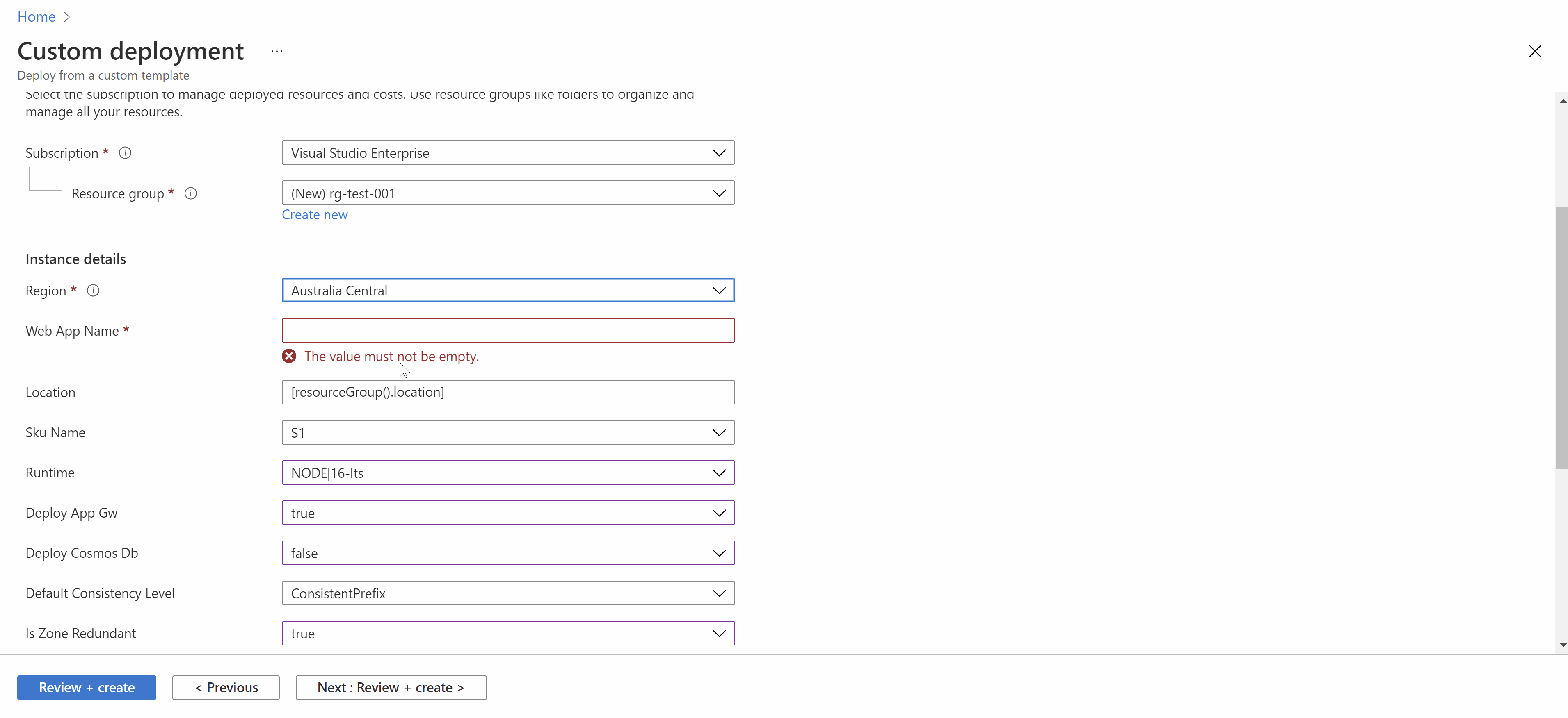
We would like to go from this experience:
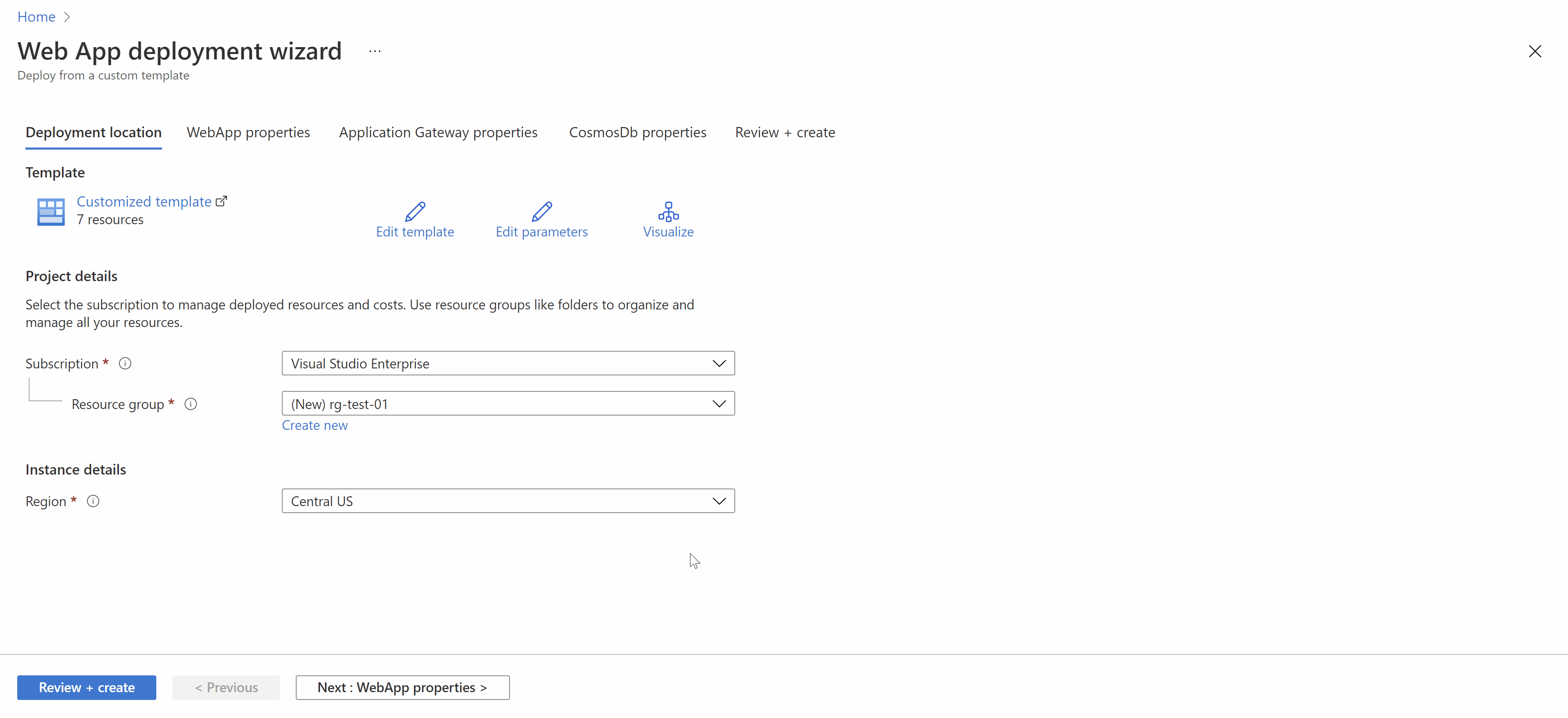
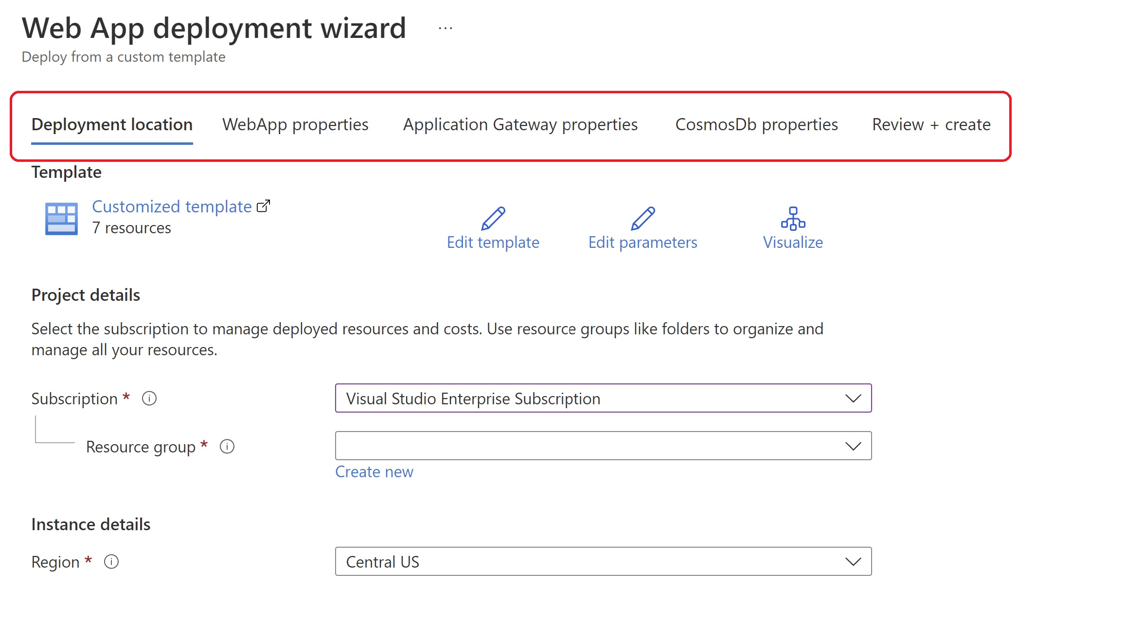
To this experience:
Overview
Azure allows you to create a “UI definition” json file to define how you would like your ARM template to look like, you can define textboxes, dropdown lists , sections,….etc to gather user input and parameters to feed into your ARM template. The structure of this file is as follows:
{
    "$schema": "https://schema.management.azure.com/schemas/0.1.2-preview/CreateUIDefinition.MultiVm.json#",
    "handler": "Microsoft.Azure.CreateUIDef",
    "version": "0.1.2-preview",
    "parameters": {
        "config": {
            "isWizard": false,
            "basics": { }
        },
        "basics": [ ],
        "steps": [ ],
        "outputs": { },
        "resourceTypes": [ ]
    }
}
Basics
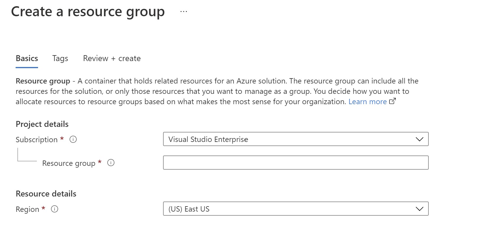
The Basics step is the first step which lets you choose the subscription, resource group, and location for your deployment.
Steps
This is where you will define your main steps/sections in the UI, each step here is a new tab which can contain multiple elements.
"steps": [
   {
   	"name": "webApp",
   	"label": "WebApp properties",
   	"elements": [
   		{
   			"name": "webAppInfobox",
   			"type": "Microsoft.Common.InfoBox",
   			"visible": true,
   			"options": {
   			"icon": "None",
   			"text": "This wizard will guide through customizing and deploying a web app with all of it's components."
   			}
   		},
   		{
   			"name": "webAppName",
   			"type": "Microsoft.Common.TextBox",
   			"label": "Web App Name",
   			"defaultValue": "",
   			"toolTip": "",
   			"constraints": {
   			"required": true,
   			"regex": "",
   			"validationMessage": ""
   			},
   			"visible": true
   		}
   ]
 }
]
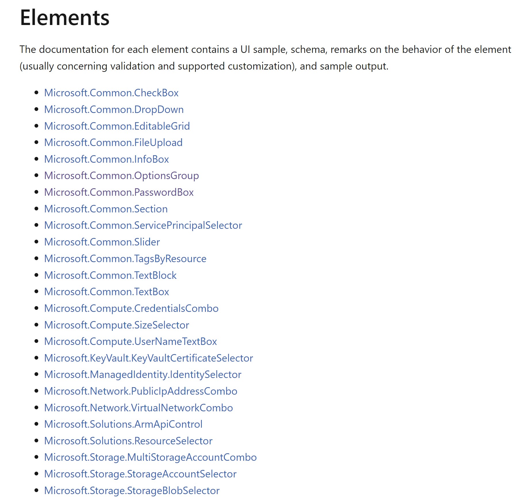
UI elements
Within each step, you can add multiple UI elemenets to make your interface easily navigated.
As an example, here is a code snippet to add a dropdown list to select the web app runtime. You can see that it resembles an ARM template definition where I have allowedValues and defaultValues. The name here is what we will reference later to export as a parameter to our ARM template.
{
   	"name": "runtime",
   	"type": "Microsoft.Common.DropDown",
   	"label": "Runtime",
   	"defaultValue": "NODE|16-lts",
   	"toolTip": "",
   	"constraints": {
   	"required": false,
   	"allowedValues": [
   		{
   			"label": "NODE|16-lts",
   			"value": "NODE|16-lts"
   		},
     {
         "label": "DOTNETCORE|3.0",
   	    "value": "DOTNETCORE|3.0"
   		}
   	]
   	},
   	"visible": true
}
One of the useful elements are sections which can allow you to group similar elements and show/hide them depending on user choices in the UI. As an example, I want to only show the Application Gateway properties if the user chooses to deploy one.
First I have a step for Application Gateway defined.
{
   "name": "AppGw",
   "label": "Application Gateway properties",
   "elements": [
   	{
   		"name": "deployAppGw",
   		"type": "Microsoft.Common.OptionsGroup",
   		"label": "Do you want to deploy an Application Gateway?",
   		"defaultValue": false,
   		"toolTip": "",
   		"constraints": {
   		"allowedValues": [
   		{
   			"label": "No",
   			"value": false
   		},
   		{
   			"label": "Yes",
   			"value": true
   		}
   			],
   		"required": true
   	 },
   	 "visible": true
   }
And within this step ,I have a section that holds all the properties of the Application Gateway that I want to show only if the radio button to deploy one is clicked. You can see the visible property for the section set to reflect that (If the deployAppGw element’s value in the AppGw step is set to true)
{
	"name": "appGWSection",
	"type": "Microsoft.Common.Section",
	"label": "Application Gateway properties",
	"visible": "[equals(steps('AppGw').deployAppGw,true)]",
	"elements": [
		{
			"name": "appGwName",
			"type": "Microsoft.Common.TextBox",
			"label": "App Gw Name",
			"defaultValue": "",
			"toolTip": "",
			"constraints": {
				"required": false,
				"regex": "",
				"validationMessage": ""
				},
				"visible": true
		},
		{
			"name": "appGwSku",
			"type": "Microsoft.Common.DropDown",
			"label": "Application Gateway SKU",
			"defaultValue": "Standard_v2",
			"toolTip": "",
			"constraints": {
			"required": false,
			"allowedValues": [
          {
            "label": "Standard_v2",
            "value": "Standard_v2"
          },
          {
            "label": "WAF_v2",
            "value": "WAF_v2"
          }
			]
			},
			"visible": true
		},
Outputs
This is where you will connect the UI with your actual ARM template, specifically the parameters that you want to expose from the UI to the template.
"outputs": {
   "parameters": {
   	"webAppName": "[steps('webApp').webAppName]",
   	"skuName": "[steps('webApp').skuName]",
   	"runtime": "[steps('webApp').runtime]",
   	"deployAppGw": "[steps('AppGw').deployAppGw]",
   	"deployCosmosDb": "[steps('CosmosDb').deployCosmosDb]",
   	"defaultConsistencyLevel": "[steps('CosmosDb').cosmosDbSection.consistencyLevel]",
   	"isZoneRedundant": "[steps('CosmosDb').cosmosDbSection.isZoneRedundant]",
   	"enableAutomaticFailover": "[steps('CosmosDb').cosmosDbSection.enableAutomaticFailover]",
   	"enableFreeTier": "[steps('CosmosDb').cosmosDbSection.enableFreeTier]",
   	"appGwSku": "[steps('AppGw').appGWSection.appGwSku]",
   	"gwCapacity": "[steps('AppGw').appGWSection.appGwCapacity]",
   	"enableHttp": "[steps('AppGw').appGWSection.enableHttp]",
   	"cosmosDbName": "[steps('CosmosDb').cosmosDbSection.cosmosDbName]",
   	"appGwName": "[steps('AppGw').appGWSection.appGwName]"
   },
   "kind": "ResourceGroup",
   "location": "[steps('basics').resourceScope.location.name]",
   "resourceGroupId": "[steps('basics').resourceScope.resourceGroup.id]"
}
And in your ARM template, you would reference those outputs as your parameters. You can see that in my ARM template which will be used for the deployment.
{
 "$schema": "https://schema.management.azure.com/schemas/2019-04-01/deploymentTemplate.json#",
 "contentVersion": "1.0.0.0",
 "metadata": {
   "_generator": {
     "name": "bicep",
     "version": "0.4.1008.15138",
     "templateHash": "3489015450172137448"
   }
 },
 "parameters": {
   "webAppName": {
     "type": "string"
   },
   "location": {
     "type": "string",
     "defaultValue": "[resourceGroup().location]"
   },
   "skuName": {
     "type": "string",
     "defaultValue": "S1",
     "allowedValues": [
       "S1",
       "S2",
       "S3",
       "B1"
     ]
   },
   "runtime": {
     "type": "string",
     "defaultValue": "NODE|16-lts",
     "allowedValues": [
       "NODE|16-lts",
       "DOTNETCORE|3.0"
     ]
   },
   "deployAppGw": {
     "type": "bool",
     "defaultValue": false
   },
   "deployCosmosDb": {
     "type": "bool",
     "defaultValue": false
   },
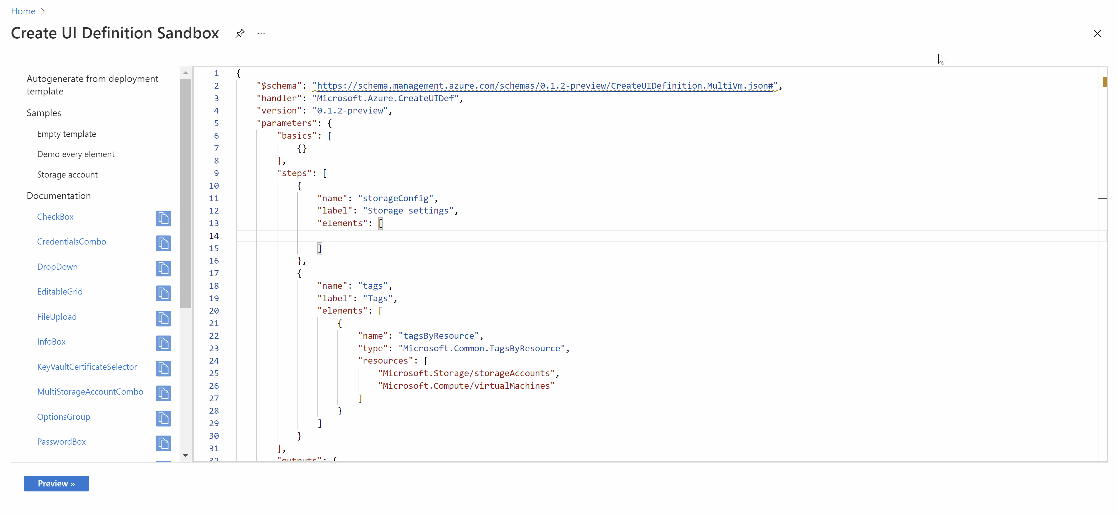
Test and create your UI in a sandbox environment
If all of this looks daunting, there is a really cool tool that can allow you to create this kind of interfaces by just dragging and dropping elements. You can use any of the samples provided or simply copy and past any of the UI elements to get the corresponding code to use. It also allows you to import your ARM template and it will generate a boilerplate UI that you can customize.
Using the UI we created
Finally, to be able to use this UI, I already have the ARM template and the UI json file in GitHub. I will create a Deploy to Azure button as below.
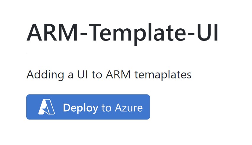
In the button code, I need to add my ARM template and reference the UI file I created to activate the interface.
[](https://portal.azure.com/#blade/Microsoft_Azure_CreateUIDef/CustomDeploymentBlade/uri/https%3A%2F%2Fraw.githubusercontent.com%2Fsebassem%2FAzure-ARM-UI%2Fmain%2Fazuredeploy.json/uiFormDefinitionUri/https%3A%2F%2Fraw.githubusercontent.com%2Fsebassem%2FAzure-ARM-UI%2Fmain%2FazuredeployUI.json)
References
- Documentation for creating UI interfaces can be found here
- Sandbox for testing and creating your UI interfaces can be accessed from here
- You can find all the code for this article in my GitHub repo.

My name is
Seif Bassem
You May Also Like
Discover configuration changes across your Azure Environment
Azure Resource Graph is a very useful service on Azure that allows you …
Azure Chaos Studio - Wreak Chaos in your Azure environment
Chaos Engineering is the discipline of experimenting on a system in …
Secure Azure Arc servers onboarding using Conditional Access
One of the most common methods of onboarding servers to Azure Arc is …